Hi, I’m Sébastien Pauchon. I’m a Swiss game designer/publisher and I’m here to tell you a bit about how Jamaica came about—a game I co-designed with Malcolm Braff and Bruno Cathala. It is published by our firm GameWorks.
Jamaica started as a contract game we designed for an insurance company. We were almost given carte blanche, the only requirement was that it should be « family oriented and playable from 2 to 6 ».
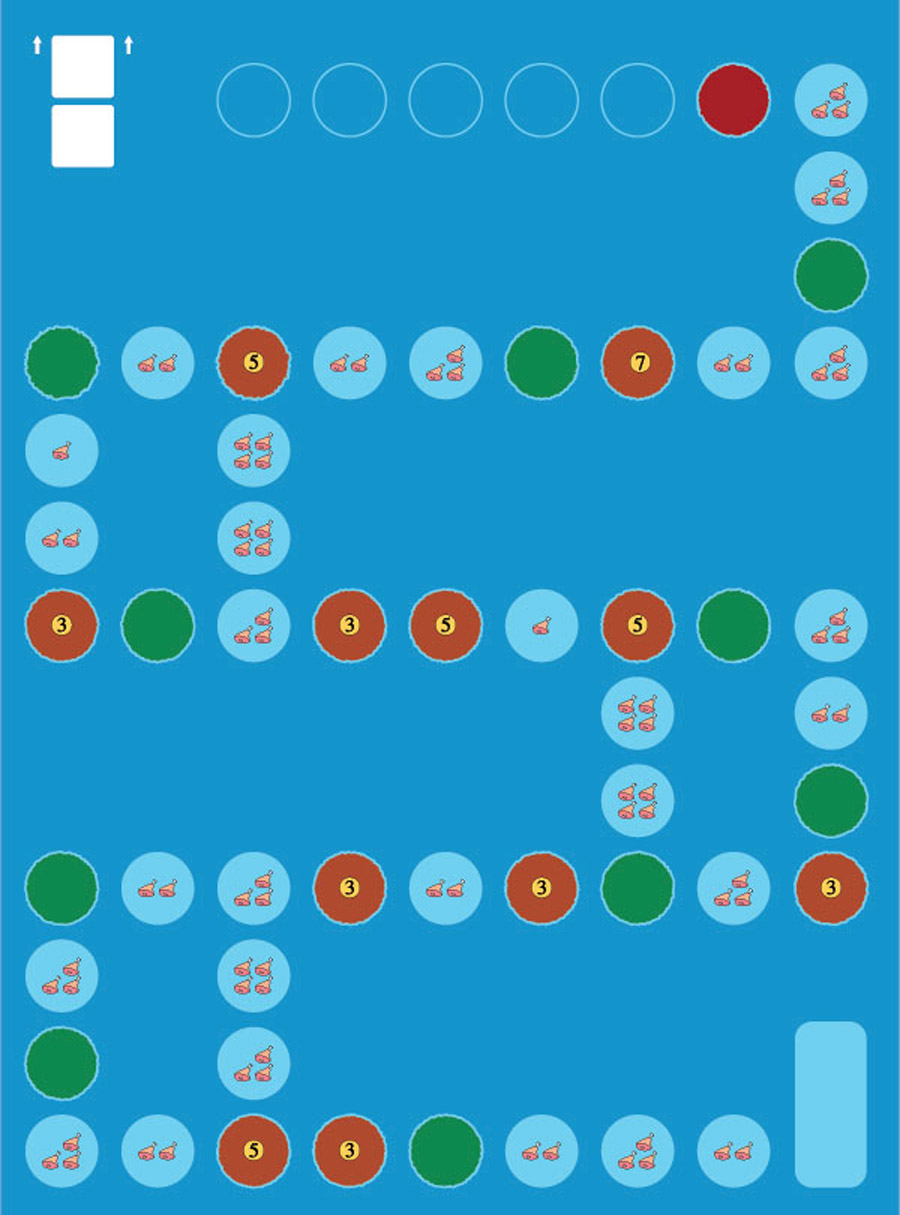
The first game board, photo by Sébastien Pauchon
We based our idea on a doodle from one of my many notebooks from the past. It was a simple game mechanic that involved cards with 2 values, ranging from 1 to 6 (a bit like dominoes), that had to be paired with action cards to create actions of various intensity. For example, a 1-6 card allowed you to follow one weak action up by a strong one, while a 3-3 card would allow you to play two actions of medium strength. I had ships in mind that could move forward, but that was all.

Early game cards, photo by Sébastien Pauchon
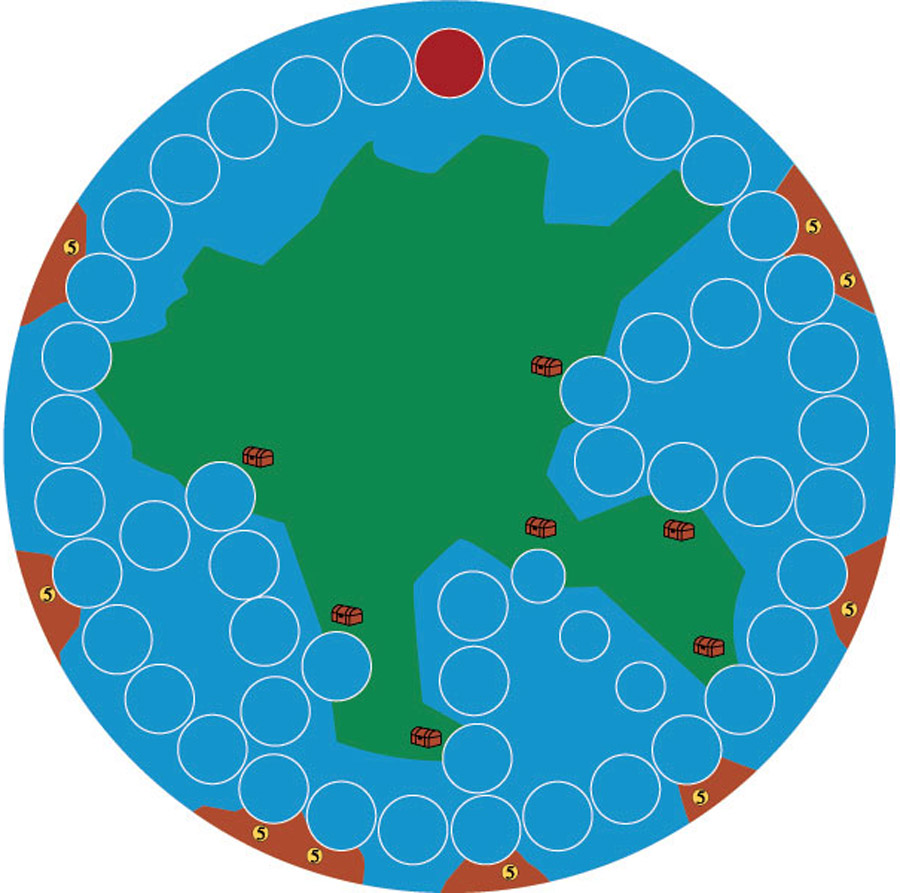
Early board iteration, photo by Sébastien Pauchon
At first, the idea was to have several numbered cards laid out and each player would select one at his turn. But this was too cerebral, as you had to combine all the available numbers with the action cards in your hand before making a choice. Therefore, we removed the numbered cards and replaced them with a single roll of two dice, which would be valid for all players for a whole round. This makes sense when you consider the targeted audience. Also, this shortened the waiting time, as all players choose a card to combine with the dice simultaneously. Even with 6 players, « thinking time » doesn’t pile up.
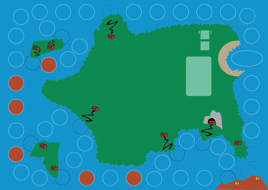
Early board iteration, photo by Sébastien Pauchon
We had ships moving forward, and were looking for actions they could do. I cannot exactly remember when, but at some point we decided those ships needed food to sustain the crew at sea, as well as merchandise to load and unload. Maybe we could call it a pick-up and delivery. Again, given the targeted audience, a simple race seemed more appropriate.
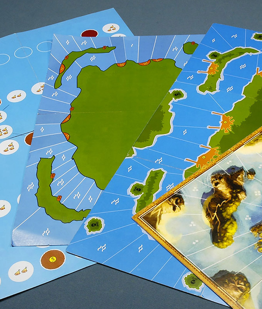
Board design iterations, photo by Sébastien Pauchon
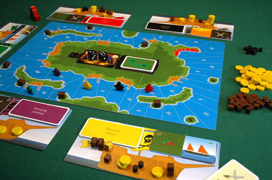
Proof of concept, photo by Sébastien Pauchon
In parallel, and to have a game with a generally well-liked theme, we decided to go for pirates having a race. From this, incorporating gold and gunpowder naturally followed.
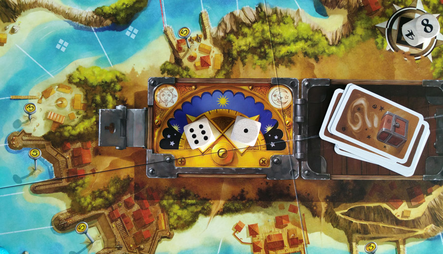
Photo by @boardgameaday
Soon enough, we thought maybe it wasn’t just a race. It was about going fast but also about collecting points along the way. Wait, pirates, points: It had to be about the gold. That’s how it became a race where you have to balance your progression with some resource management, especially your gold, as each coin is worth 1 point at the end of the game.
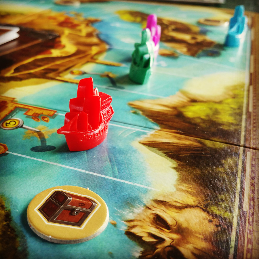
Photo by @boardgameaday
From the outset, the end of the game was triggered by a ship reaching Port Royal. The problem was that players didn’t have much enticement to move forward. To fix this, we added a reward for the slot your ship is on at the end, with quite a bonus for making it around the island, as well as a penalty for dragging too much behind.
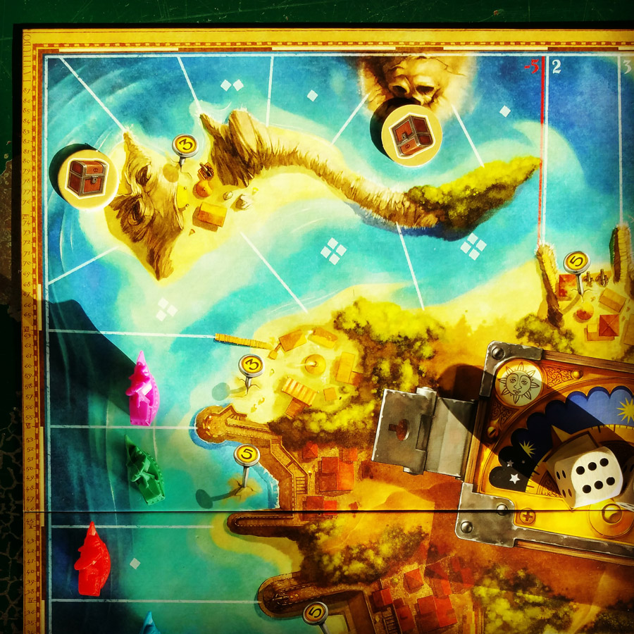
Photo by @boardgameaday
At that point, we almost had all the final elements in place. Combat was very straightforward, one roll each, and then: Boom. Points where simple: Ship position + gold + treasure cards (which we put in almost right away, as they allowed for split paths on the board: Short with less pirate lairs, and a longer one with the opportunity to grab additional gold).
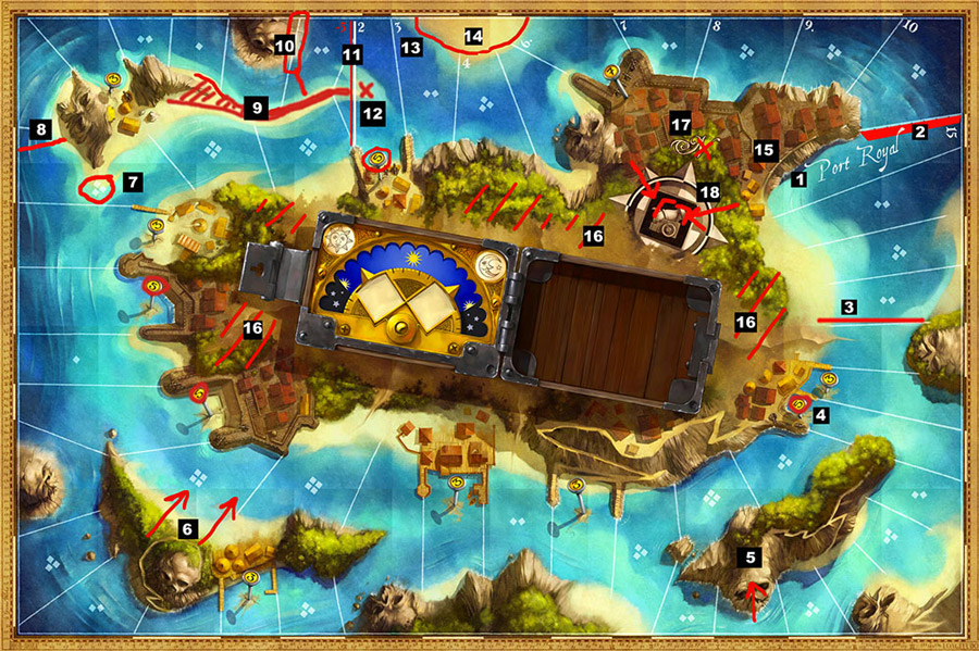
Game board with feedback in red, photo by Sébastien Pauchon
One last thing didn’t work quite well though: Even with the bonus and penalty depending on your ship’s position, it was possible to win by staying behind and focusing on amassing gold. This is where the 5-hold system came into play, as it forces you to constantly throw away stuff if you go for a hoarding strategy. Also, this way you cannot have more than 6 gold per hold, for a maximum total of 30.
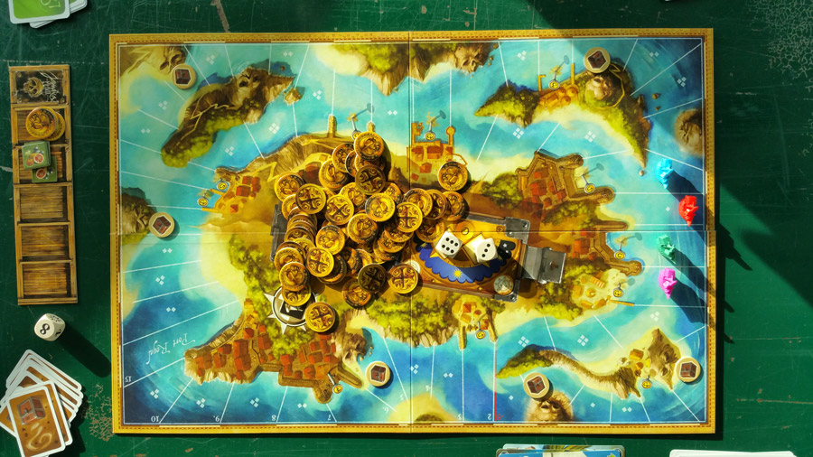
Photo by @boardgameaday
Once we were done designing, Malcolm and I proceeded to the publishing phase. As for any game, you need rules, components, a box, illustrations, etcetera.
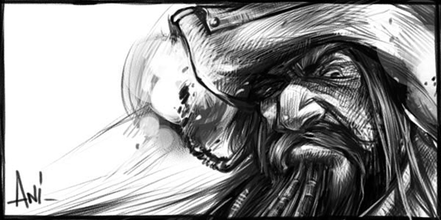
First (unused) sketch by artist Mathieu Leyssenne
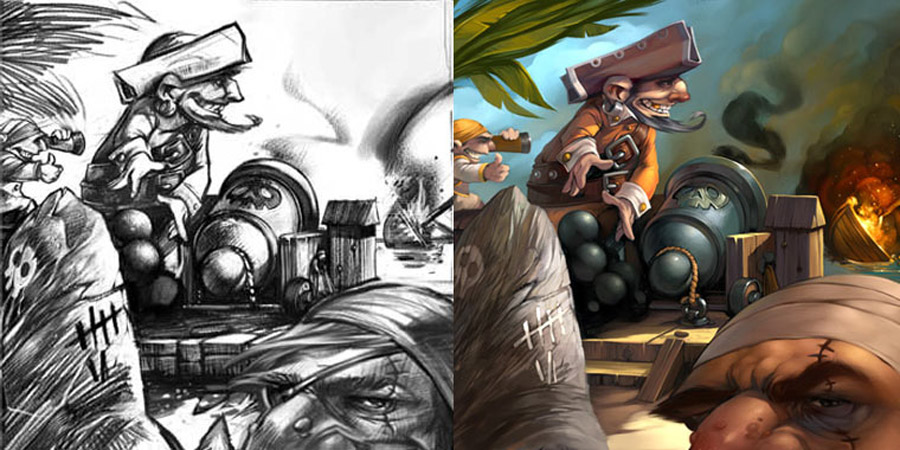
Art by Mathieu Leyssenne
We were quite lucky to get hold of Mathieu Leyssenne who did a fantastic job at creating a great-looking, fresh, fun and classy look for the game and its box, originally looking more like a treasure chest than today’s version. Get a good artist for your games, and it will be a pleasure to play with the components later on.
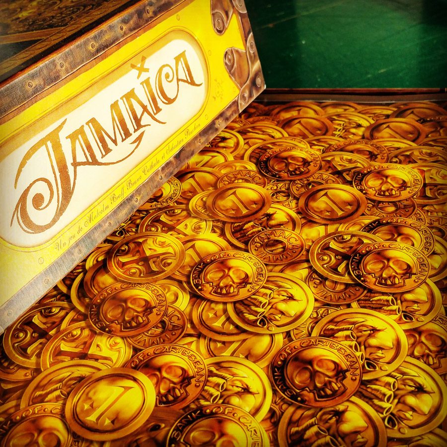
Photo by @boardgameaday
There are maybe three noteworthy decisions that might be worth sharing about the development of the game as publishers. These are all details about ergonomics, and they may not immediately strike you as important, but they were real a-ha moments for us.
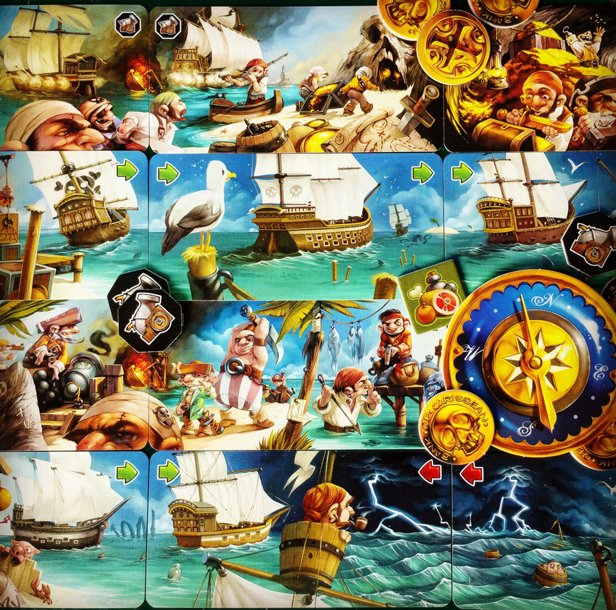
Photo by @boardgameaday
Card Format
The original action cards were sized like regular poker cards, with the first action at the top, and the second at the bottom. The dice where therefore put on the board in a vertical position, in slots numbered 1 and 2. But, even if it was pretty obvious which die commanded which action, we did not play a single game during which someone would not ask « am I allowed to do the bottom action first? ».
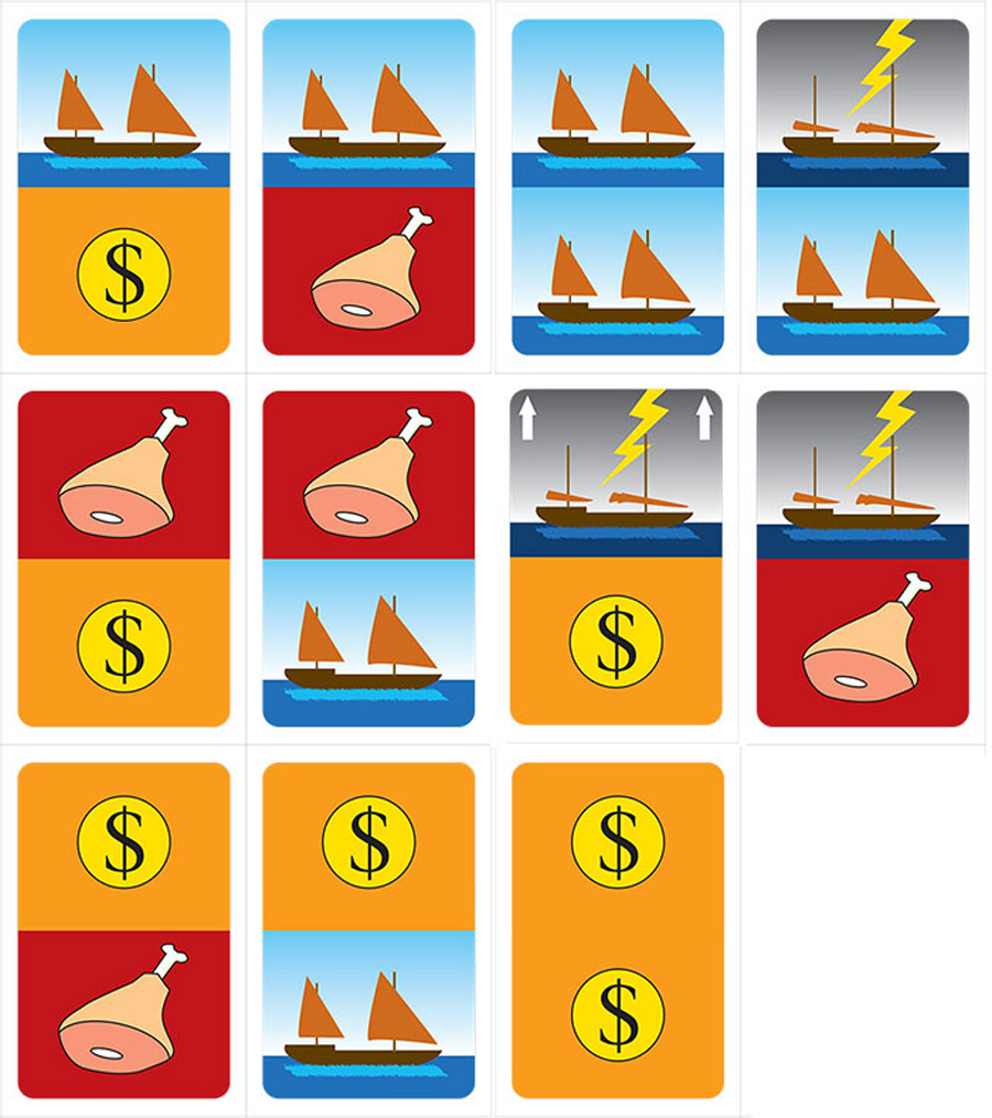
Original vertical cards, a nice example of bad ergonomics. Photo by Sébastien Pauchon
During a brainstorm session (I believe we were looking for an original card format), we considered using more of a tarot format (2:1) because it just looked like an old card. As soon as we took such cards in hand (you can find cards close to this in the original Condottiere) we had the natural idea to rotate them 90° and everything fell into place :
1) a horizontal format allows you to hold them like a gamepad and by slightly sliding them upward you can see all your actions with a single glance.
2) the format allows for more natural illustrations, as there is only one continuous horizon and one sky (which led to today’s panorama you can create by putting all the cards side by side)
3) the game action sequence left-right is much stronger and since then no one ever questioned the morning-evening sequence.
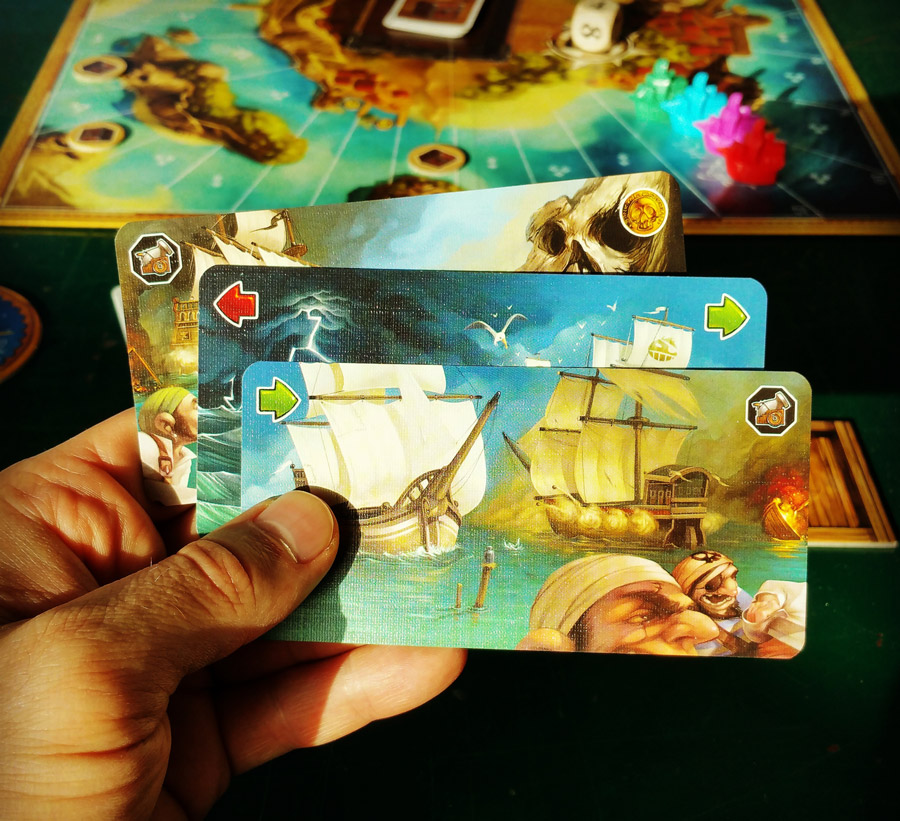
Photo by @boardgameaday
Combat Die
There was no extra combat die for a long time. You just played gun powder (or not) and rolled a regular 6th die. There was a problem with that, however: the powder was very, very strong, and in comparison, the die was weak, sometimes even feeling like a foot note. The first thing we did was to reduce the amount of powder needed.
With 1-2, you only took 1 powder, with a 3-4 only 2 and with 5-6 only 3. Less powder at your disposal made for a stronger die. This was clever. Well, kind of, because the balance gained had a cost in ergonomic terms. Loading gun powder became the only action in the game where the result of a die was not always worth its value, which was also pointed out by our client during a validation session.
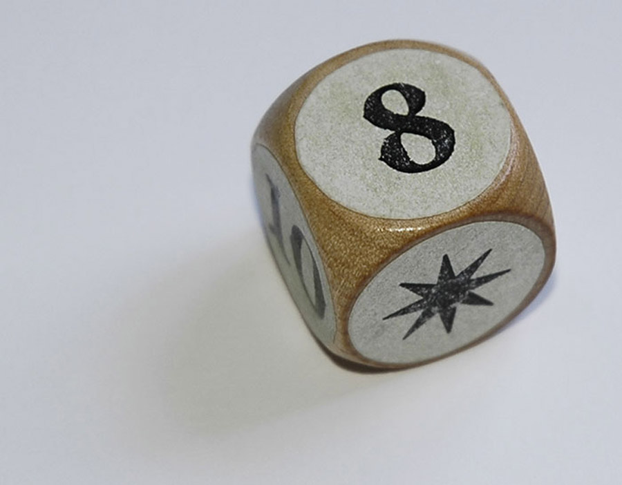
The Combat Die, photo by Sébastien Pauchon
It was during a train ride that we suddenly came up with the idea of an extra combat die. It’s value could be twice that of a regular die (2-4-6..), and that would automatically divide the power of the powder by half, while the players could be back at loading gun powder with a 1:1 ratio, the same as for all the other chips.
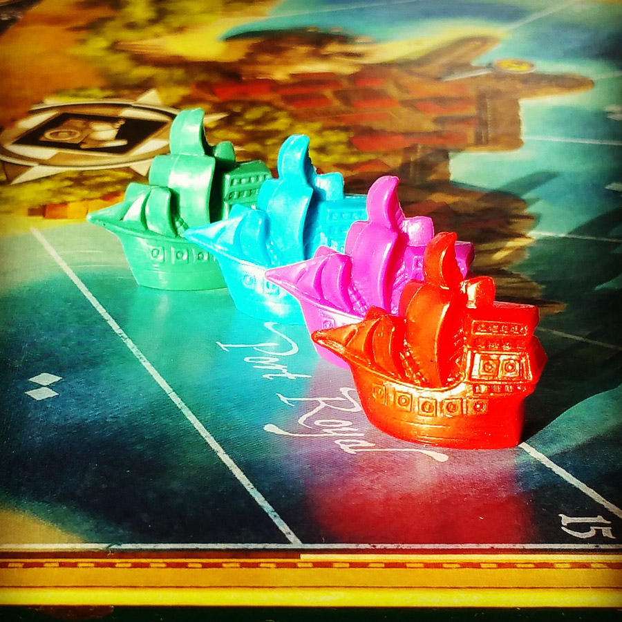
Photo by @boardgameaday
Rules
The first game we ever published was a simple card game called Animalia, a contract game for the same client. Since it was our first release as a publisher, we had a launch party at the Swiss Museum of Games, which happens to be nearby. We sold quite a few games that night (friends, family and neighbors attended in large amounts), which is of course nice, but the really interesting part was that those games ended up with people we knew. This meant that we eventually got direct feedback from the so-called « non-players », and that is not always the case with games sent out into the world.
It was a very valuable experience, because what we heard the most was how difficult our game was and how complicated the rules were! As the game is pretty simple, we first assumed they were all just not used to reading rules, or, in the worst case maybe a bit dumb?
But… who is really dumb here? The guy who never reads rules and can not completely figure out how a game works or the guys who are supposedly game specialists but can’t put together a set of rules readable by (ideally) everyone. This is a very important question.
So, just like probably hundreds of publishers before us, we came to the conclusion that the most difficult part of publishing is creating a good set of rules. We decided to take special care of the rules, and that eventually took us 6 months. We consulted with a friend of ours who is doing research in the neuro-cognitive field. She told us a lot about how memory works and that people can only process a certain amount information chunks at a time.
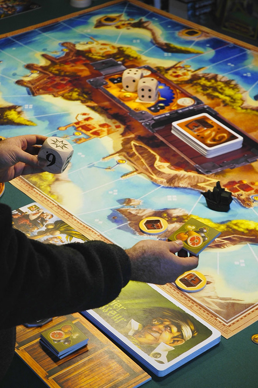
XXL demo edition, photo by Sébastien Pauchon
On a parallel track, I remembered my daughter asking to play Piranha Pedro the previous year. She was 5 then, and I was pretty sure we had never played this particular game with her before. As I told her so, she answered, « yeah, but I read the rules ». Which was funny as she could not read at the time. Now, if you remember the original rules by Goldsieber, they were in the form of a cartoon. She had actually flipped through the rules simply looking at the pictures. And her general idea of the game turned out to be pretty good. Information I stored away for later.
Combined with the fact that you usually find illustrations when the rule book is at loss of words because of a overcomplicated situation, we decided to have rules that would illustrate everything happening in the game. Basically, we were aiming for illustrations with a caption instead of words accompanied by an illustration.
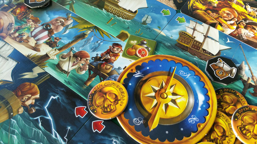
Photo by @boardgameaday
Phrases like: « The first player then passes the compass token to the player on his left. That player becomes first player, takes the two dice and rolls them before choosing how to place them on the board » already require a familiarity with games as well as a certain amount of abstraction to be digested in a single read. We wanted to see if there was a way to have the rules understood by really anyone.
All this made us go for a very illustrated rulebook, with as little text as possible, all on the same page divided by islands. The islands are there because of the theme, of course, but not only: they provide for a natural way to separate and regroup information by type (game turn, game end, etcetera).
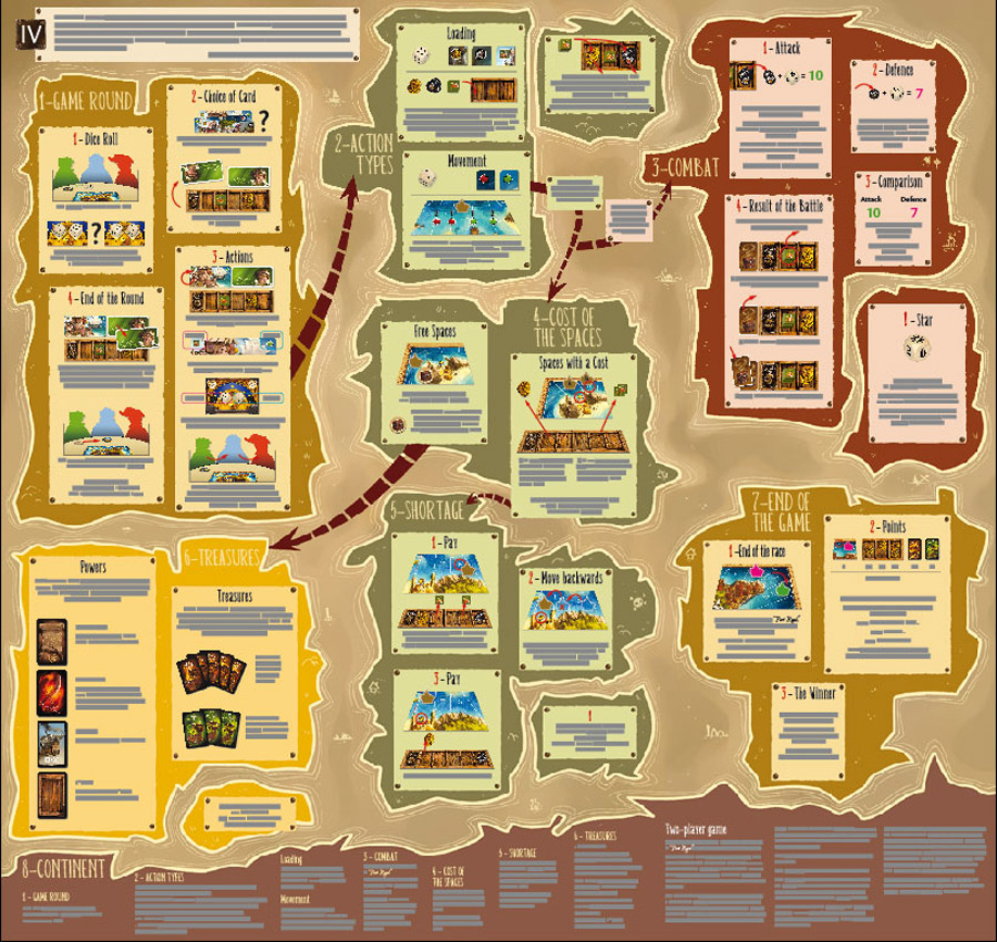
The rules, photo by Sébastien Pauchon
The downside of this is the weird big format some players have complained about, but the upside we have noted over the months of tests we conducted convinced us of pursuing the idea:
– We have seen groups where the reader was actually showing the various islands to the others, which I have never seen in any other reading.
– We have seen tests where all the players were involved in reading and looking at the map, the same situation as mentioned above.
– Also, we have seen the players find information they were looking for with unprecedented speed (in our experience, of course).
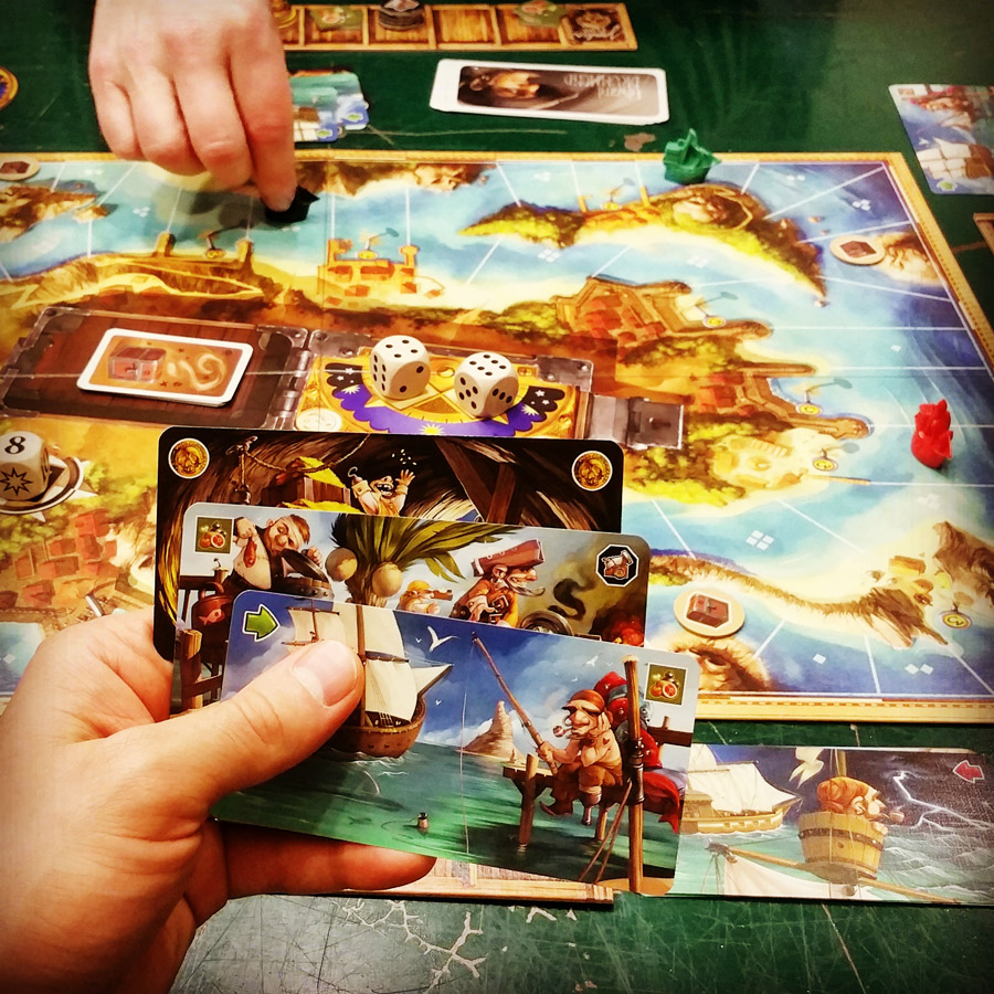
Photo by @boardgameaday
I remember the best « yes! » moment we have had during one of those tests very clearly. It was a group of 3, the reader sitting across the table from the other two (which meant the rules appeared upside-down to them). At one point in the game, they had a question about combat, and as the reader was unfolding the rules to check this particular point, the girl on the other side of the table said: « Check out the combat section, it is the upper right island, the red one, I think ». And that nailed it for us. I own 1000+ games, I have played most of them and read as many rulebooks during gaming nights, and an answer was never located that fast and precisely. And definitely not by a player who had not really read the rules…
We ended up being awarded the Essener Feder (German best ruleset of the year award), and that was very nice, because as mentioned before, we did put in quite an amount of time working on them.
Photo credits: Sébastien Pauchon / @boardgameaday. Used with permission.
Get Jamaica on Amazon.
Did you like this story? Please share or comment. Go to this page to submit a story yourself. Subscribe to our online magazine here!

Great looking game!
I’m intrigued why an insurance company would be producing the creation of a game! Could you give some background/reasoning as to how this came to be?
My family loves Jamaica! Great game. The artwork is wonderful, and the insert that organizes all the cards and bits is one of the best designed of any board game. Can’t wait for the expansion.
I enjoyed seeing all the iteration photos. It really drives the point home that game components matter very much. It’s also evident how much thought and love went into the effort. My family has logged over twenty plays, and it’s a good time every time. Love the expansion too, though it makes for a very different game in terms of points. So does the insurance company own any game rights? I posted a forum link to this article on BGG. Thanks for writing this up.
It was a great reading! Thanks for sharing this designing process with us. I definetely pushed me to finally purchase this game. I hope me and my family can enjoy it as much as I anticipate 🙂
Is there a way to buy an xxl version of the game? That would be a big hit with the kids at church.
Your blog post was a great read! I found the content to be interesting and the writing style to be engaging. To learn more about this topic, click here.
Your point of view caught my eye and was very interesting. Thanks. I have a question for you. https://www.binance.info/join?ref=53551167
It’s a game. Five dollars is free. Try it It’s not an easy game
->-> 토토사이트
Thanks for sharing. I read many of your blog posts, cool, your blog is very good.
Thanks for sharing. I read many of your blog posts, cool, your blog is very good.
Thanks for sharing. I read many of your blog posts, cool, your blog is very good.
Thank you for your sharing. I am worried that I lack creative ideas. It is your article that makes me full of hope. Thank you. But, I have a question, can you help me?
Can you be more specific about the content of your article? After reading it, I still have some doubts. Hope you can help me.
flush factor plus scam: flush factor plus scam
neuroquiet scam: neuroquiet scam
arctic blast scam: arctic blast scam
Can you be more specific about the content of your article? After reading it, I still have some doubts. Hope you can help me.
Can you be more specific about the content of your article? After reading it, I still have some doubts. Hope you can help me.
Your article helped me a lot, is there any more related content? Thanks!
Thanks for sharing. I read many of your blog posts, cool, your blog is very good.
Your point of view caught my eye and was very interesting. Thanks. I have a question for you. https://www.binance.info/uk-UA/register?ref=W0BCQMF1
Your point of view caught my eye and was very interesting. Thanks. I have a question for you.
I don’t think the title of your article matches the content lol. Just kidding, mainly because I had some doubts after reading the article.
Thank you for your sharing. I am worried that I lack creative ideas. It is your article that makes me full of hope. Thank you. But, I have a question, can you help me?
I don’t think the title of your article matches the content lol. Just kidding, mainly because I had some doubts after reading the article. https://accounts.binance.com/zh-TC/register-person?ref=DCKLL1YD
Thanks for sharing. I read many of your blog posts, cool, your blog is very good.
Thanks for sharing. I read many of your blog posts, cool, your blog is very good.