Well hello there. The name is Joost Das, designer of digital and analog games, while at the same time working as an illustrator and graphic designer. Over the last 2 years I have directed all my free time, experience and skills into my latest project: Hylaria. A very easy to learn social game that pits two teams against each other for 30 minutes of hilarious fun. Now you might ask, ‘Dude, does it really require so much time and effort to make a simple party game?’ Well, with your permission I’ll pull back the curtains a bit and give you an idea of the process behind creating a game like this. Let me start with giving you a quick run-down of the game itself.
Hylaria is a game for 4, 6 or 8 players who split into 2 teams of equal size. Before the game starts, both teams come up with a secret code. This code should allow them to communicate with each other, while keeping the opposing team in the dark. During the game, they will use this code to tell their teammates about the illustrations on the tiles they have facedown in front of them. Because here is the kicker: you never get to play your own tiles!
Instead, you try to grab the right tile at the right time from either your teammates or your opponents and see if it will score points for your team (see below). Which tile you take will depend on the info you got from all the other players during the round. First team to score 22 tiles wins. Have a look below to see what I mean.
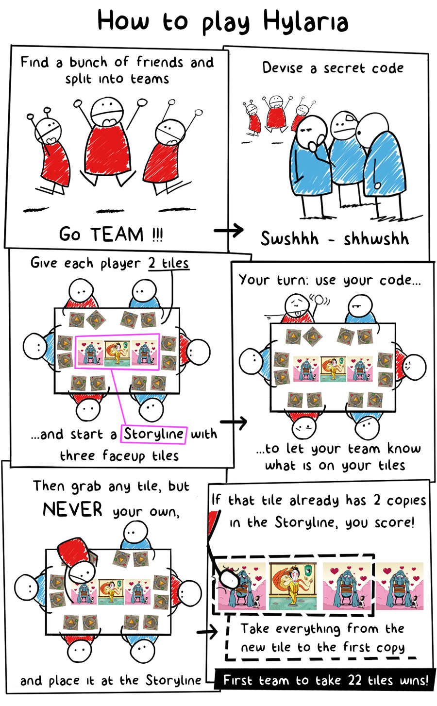
Quite simple right? However, as with other games in this genre, like Dixit for instance, you really have to play at least once in order to understand why this is so much fun. Therefore I’m not writing this to try and convince you that the game is fantastic, but rather to tell you about the process that led to Hylaria as it stands right now, a finished game.
Designing for a broad audience
As a designer, you can set a bunch of different challenges for yourself. Design a game about a particular, yet untouched theme for instance. Make a brainburning masterpiece with hundreds of intricate mechanisms that leave your players exhausted from the challenge. Et cetera, et cetera.
For Hylaria, my goal was getting as many different kinds of gamers and non-gamers around the table as possible and keep them coming back for more. A clearly defined challenge, but not an easy task I assure you.
In my view the game should have the following attributes to accomplish this:
- Presentation should be appealing to many
- Rules should be extremely easy to learn and teach
- The game should remain interesting despite its simplicity
Presentation
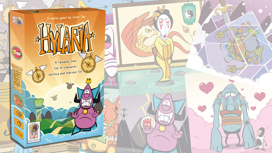
This part can be short and sweet. You can see from the pictures of the game’s components that I went for a very cartoony, over-the-top style. Of course, the art style of a game should be in line with the type of gameplay people can expect. These graphics would never work in a serious cube-pusher, but it does fit with a wacky kind of experience.
Besides that, cartoons appeal to a very large audience. Kids (duh) and adults alike. Namedrop Adventure Time or Rick and Morty in any gathering of 30-somethings and most of them will smile in sweet recognition and enthusiasm.
In fact, I’m writing this at my office sitting across a 33 year-old guy wearing a shirt depicting an anthropomorphized egg riding an anthropomorphized piece of bacon. So I feel safe in saying that a colorful, happy and zany style works well for getting loads of people interested in playing Hylaria and loving the experience afterwards.
As easy as 1 – 2 – 3
Like a very young Michael Jackson showed already (am I exposing my age here?), something as easy as 1 – 2 – 3 can find a warm home into many people’s hearts. You narrow your target audience with every extra page of rules for your rulebook. Complex and meaty games can be great of course, but they only find an audience with hardcore boardgamers. And that wasn’t my mission here.
In Hylaria you can find the easy 1 – 2 – 3 in a player’s turn:
- Draw new tiles until you have 2 in front of you again.
- Use your code to convey the content of your tiles to your team.
- Grab a tile from another player, place it in the centre of the table and see if you score.
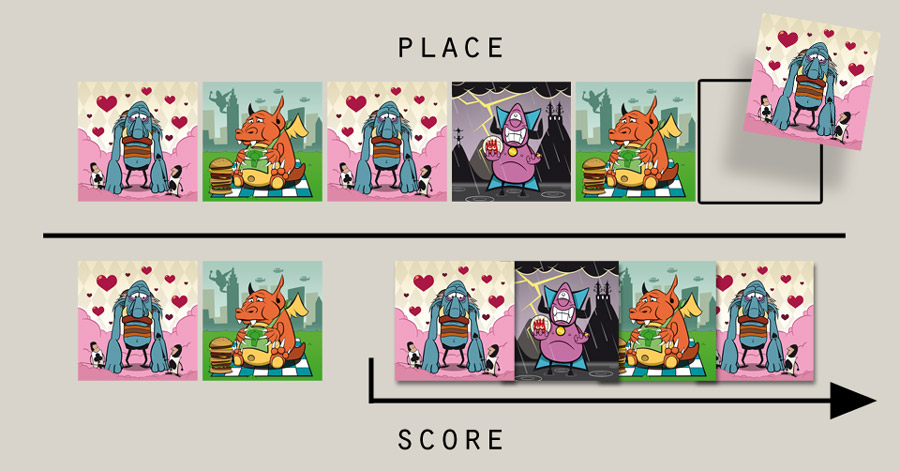
Scoring works as follows. The game starts with 2 face-up tiles in the center of of the table, called the Storyline. During the game, tiles are placed to its left or right, making the Storyline grow. As soon as there are 2 of the same tiles in the Storyline, there is an opportunity to score. When placing a third tile with the same illustration, the team scores all tiles from the newly placed tile up until the first copy (see below).
A sneaky way to pump more tactics into the game and reward the team for coming up with a clever code is the following, again simple, rule:
Players have to decide to place the tile on the left OR the right of the Storyline before flipping the tile face up.
You will see in the example that, if the active player would have placed the Troll on the left of the Storyline, he would only have scored 2 tiles for his team. By placing it on the right, he scores twice as much. If he had only known that the tile he grabbed was a ‘scorable’ tile he might have guessed it was a Dragon and placed it on the left, in an attempt to score 3 tiles. This little mechanism rewards the team with the most knowledge of all the face-down tile on the table.
Throughout the development of this game many darlings had to be killed in order to keep with the KISS adagium. Keep It Simple Stupid. For the longest time, I used all unique tiles where all the characters were depicted on all different backgrounds. Players could score by finding either the 3rd character or the 3rd background. Why did I design it this way? Well, I thought it was a unique and interesting thing to do and it didn’t even cross my mind to make it simpler. However, as soon as I tried a cleaner approach of just having 8 different illustrations, all the playtests went so much smoother that I never looked back.
Keeping it interesting
But how does one make sure the game remains interesting when it is such a lightweight? Well, consider that wonderful gem in gaming; Dixit. This is also a 1 – 2 – 3 game in my opinion, but is endlessly replayable because of a crucial factor: Freedom. Players have absolute freedom to describe their cards in this game. There are no rules for what you cannot say or cannot do. You just have to make sure that some, but not all players will get your description in order to score. Giving this amount of freedom to the players moves the depth and complexity from the rulebook to the creative minds of everyone at the table.
Hylaria takes notes from that design. As you can see in the comic, players will sit between two opponents. When they describe the tiles they have in front of them, there is no restriction to what they can say, do, sing, tap on the table, whatever. If you are too obvious with your description, the opponent to your left will score with your tile. If you’re too vague, your teammates won’t know what you are talking about.
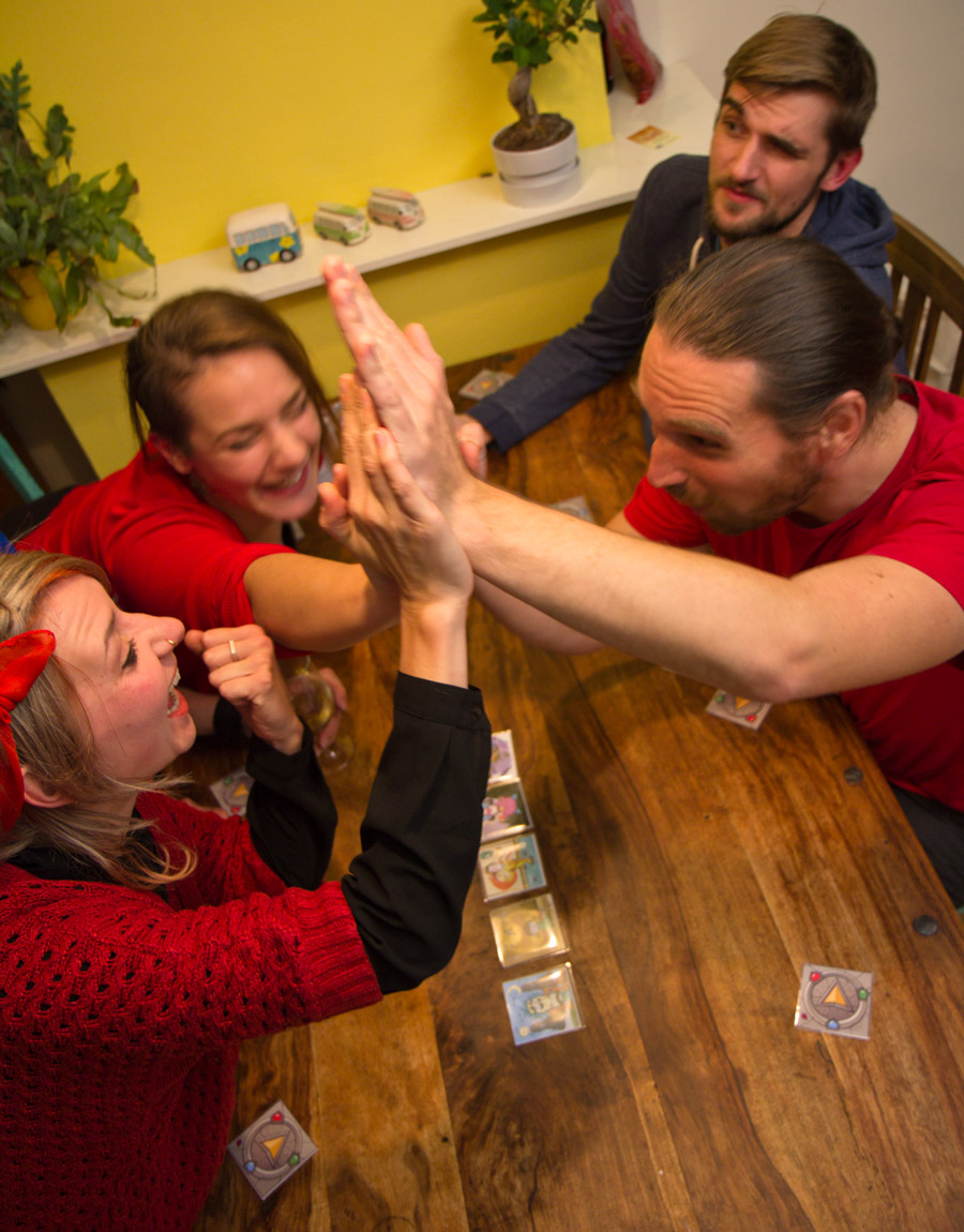
In part 2 I’ll describe the design behind all the illustrations and how that allows for many many different codes to be dreamed up. For now, suffice to say that I’ve held countless playtesting sessions and the creativity of people never ceases to amaze me. Set your players free and see what they come up with!
When the Illustrations are the game
Alrighty then. Let’s get into the design process of all the illustrations of Hylaria. My goal was clear here: give the players as many opportunities as possible to come up with unique codes for their team.
I sat down to write a list of all the elements that could be implemented on a 68 x 68 mm tile. This is what I wrote down:
Character:
- Emotion
- Hand gesture
- Pose
- Main color and clothes
- Hairdo
Background:
- Colors
- Theme
- Pop culture references
- Thematic elements
- Human / non-human
- Gender (for the humans)
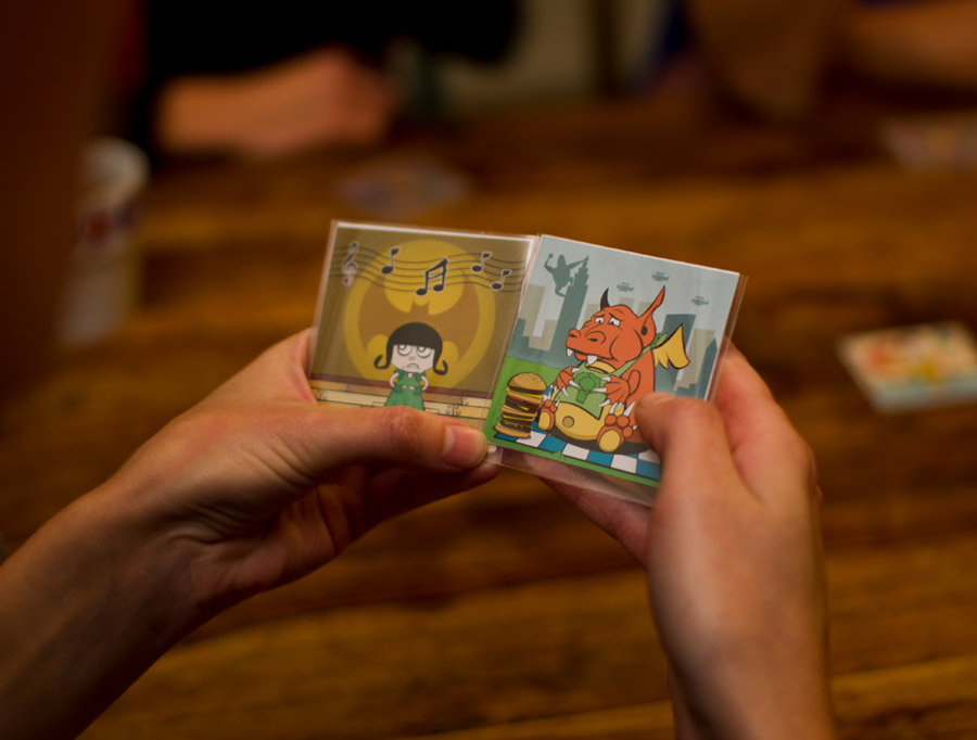
Here are two illustrations as an example.
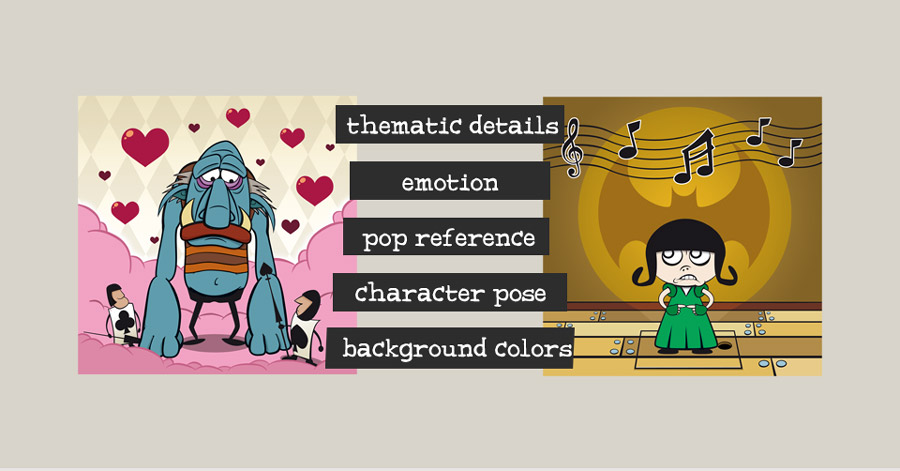
I simply made an overview with every element of every character tile. For the Troll character Bernard for example, the list was as follows: Non-human, blue, sad, hands down, knees bend, love, Alice in Wonderland, pink, semi-bald.
I made sure a few elements slightly overlapped. Just to mess things up a bit.
And after that, it was a question of drawing, testing, redoing, throwing overboard, start anew, rinse and repeat. Now the game has 8 completely different characters (x6) and the players have unlimited options to start their creative process when building codes.
Use everything you have
Hylaria has only one type of item in the gamebox besides the rulebook and scoreboard. And those are the tiles. The front of the tiles was covered in my opinion, but why not use everything you have? I decided to give the option to players to make full use of the back of the tiles as well.
One big arrow was placed in the center of the tile. 3 gems were place on the circle surrounding the main arrow and a lonely ladybug was placed in the corner.
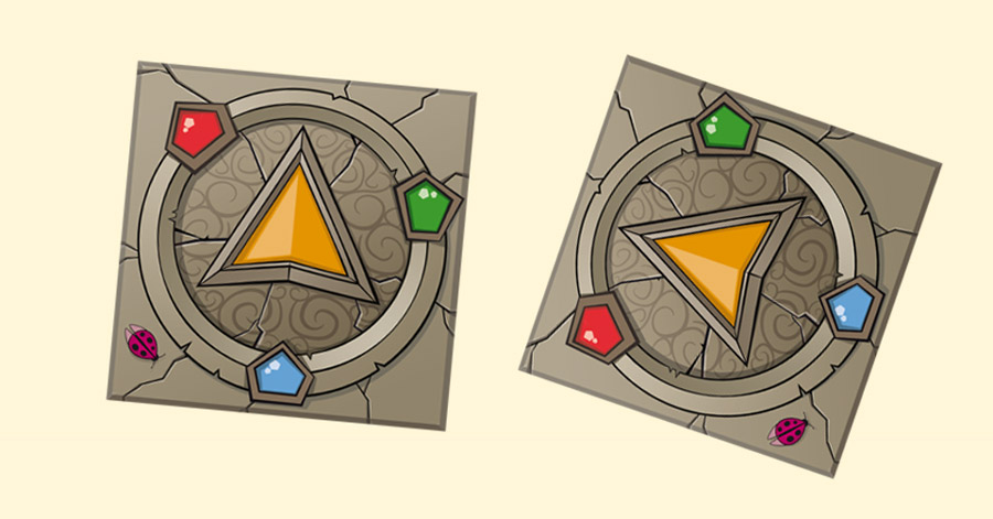
There is nothing in the rulebook that tells players how to use this. They don’t need to make use of it at all, it is simply an option. Maybe think of something in conjunction with another form of code for instance. This simple trick multiplies the options available to players immensely.
Clarity
A good practice in game design is stepping back from your work every once in a while and imagine people playing your game for the first time. What will they pick up right away? What is so unique or complex about your game that you really have to sit down and explain it, even to avid gamers? What will make sure that players come back for more? How long do you think one turn will take and what do the others do in the meantime?
Imagine them sitting around the table. Where do all the components go? What do people need to see clearly and keep track of, in order to play well?
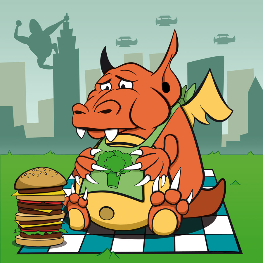
For Hylaria, this was quite easy. Players will need to see two things happening on the table:
- All the tiles in the center of the table and as much of the detail on them as possible
- The orientation of the facedown tiles in front of every player (because this can be used in codes).
I needed to make sure that all the elements, gestures and emotions we easy to spot from a distance. Everything needed to be big and clean. I therefore opted for very little gradient effects, sharp shadows and high contrasting colors. I also used clear, black outlines for all the characters in the game. This way, players would never need to bend over the tiles for a closer look, but could enjoy sitting back and observing their teammates and opponents.
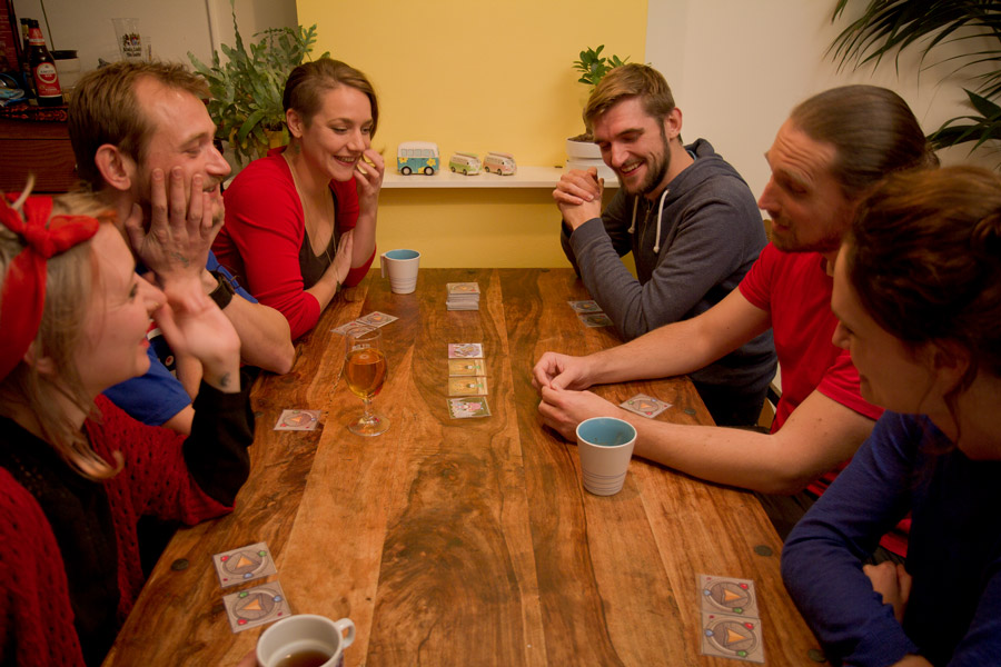
There are of course still many things to say here. But if you made it to the end of my story, I applaude you. Please let me know what you think, and if you want to know anything more about me or this game, please let me know. I would be happy to answer any question you have!
Hylaria is seeking funding on Kickstarter until December 16, 2016!
Did you like this story? Please share or comment. Go to this page to submit a story yourself. Subscribe to our online magazine here!
Thank you so much for reading my story. If you want to know anything else, let me know!
Your article helped me a lot. what do you think? I want to share your article to my website:
Cool. I spent a long time looking for relevant content and found that your article gave me new ideas, which is very helpful for my research. I think my thesis can be completed more smoothly. Thank you.
This is a great inspiring article. I am pretty much pleased with your good work. You put really very helpful information.
Sherlock Coat
Your point of view caught my eye and was very interesting. Thanks. I have a question for you. https://www.binance.com/ph/register?ref=GJY4VW8W
Navigating the complex landscape of economy essay https://paperwriter.com/blog/deconstructing-the-ideal-economics-essay can be challenging, but PaperWriter’s blog on deconstructing the perfect economics essay provided a clear roadmap for success. Their expert analysis and practical tips helped me untangle complex economic concepts and structure my essay effectively. Thanks to their guidance, I gained a clear understanding of how to create well-reasoned arguments and articulate ideas coherently.
It’s a game. Five dollars is free. Try it It’s not an easy game
->-> 토토사이트
It’s a game. Five dollars is free. Try it It’s not an easy game
->-> 카지노검증업체 .COM
Can you be more specific about the content of your article? After reading it, I still have some doubts. Hope you can help me.
Hylaria is a game for 4, 6 or 8 players who split into 2 teams of equal size. Before the game starts, both teams come up with a secret code. This code should allow them to communicate with each other, while keeping the opposing team in the dark. During the game, they will use this code to tell their teammates about the illustrations on the tiles they have facedown in front of them. Because here is the kicker: you never get to play your own tiles!
I don’t think the title of your article matches the content lol. Just kidding, mainly because I had some doubts after reading the article.
Thanks for sharing. I read many of your blog posts, cool, your blog is very good.