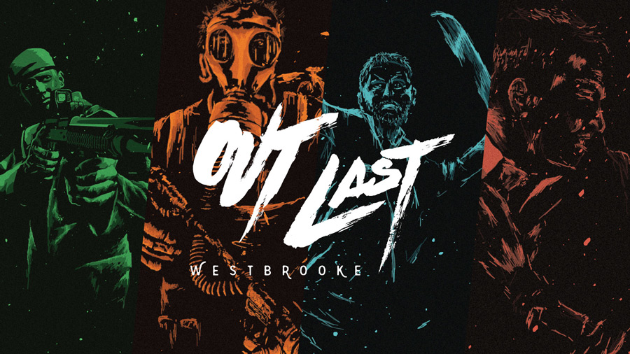
Out Last: Westbrooke has been in the works for over a year and half created by two designers, Nathan and Kevin. The first six months were spent just dialing in the rules and concepts. Creating prototype after prototype and countless playtests. After the rules and game play had been solidified, Nathan got to work on creating the illustrations for the game. Knowing that Out Last was going to be a zombie game, Nathan wanted to make sure that the artwork really pushed that theme.
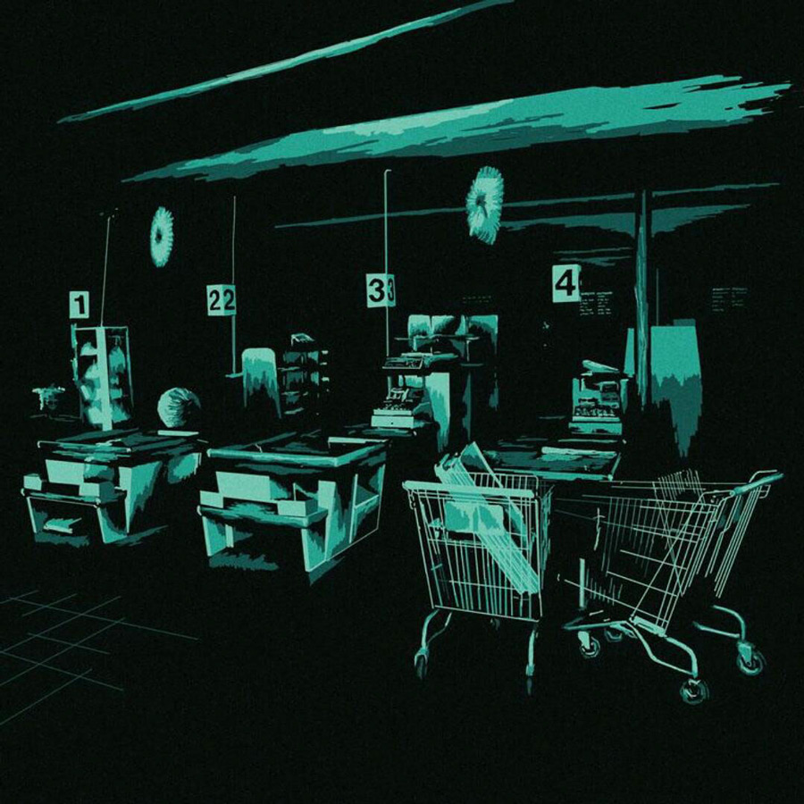
Knowing that there were already a bunch of zombie games out there, Nathan and Kevin knew that the artwork really needed stand out and be different. They looked to all different sources of inspiration such as movies, concert posters, video games, and other talented illustrators. After a few months of creating different illustrations, Nathan landed on a style that they found really striking and began to really develop that style. The artwork is dark, rough, and grungy which really helps to create that sense of not knowing what could be waiting for you in the shadows.
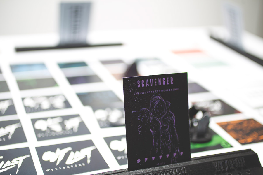
The gameplay of Out Last has been inspired by many different sources including other tabletop games, movies, and video games. Kevin and Nathan enjoy playing cooperative games and wanted that to be an aspect in Out Last. They found that those games can sometimes be anticlimactic in the end so together they decided that rather than just working together against the game if you had to work against another player that would achieve the competitive nature that was desired. It also makes strategizing and keeping that strategy secret a very fun aspect of the game.
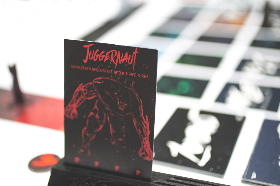
They also wanted there to be a good amount of tension from start to finish which is why the nuclear bomb component was added to always make you wary of how much time is remaining in the game. Along with having to fight off loads of zombies this achieves that desired amount of pressure. This will surely keep you on the edge of your seat the entire game!
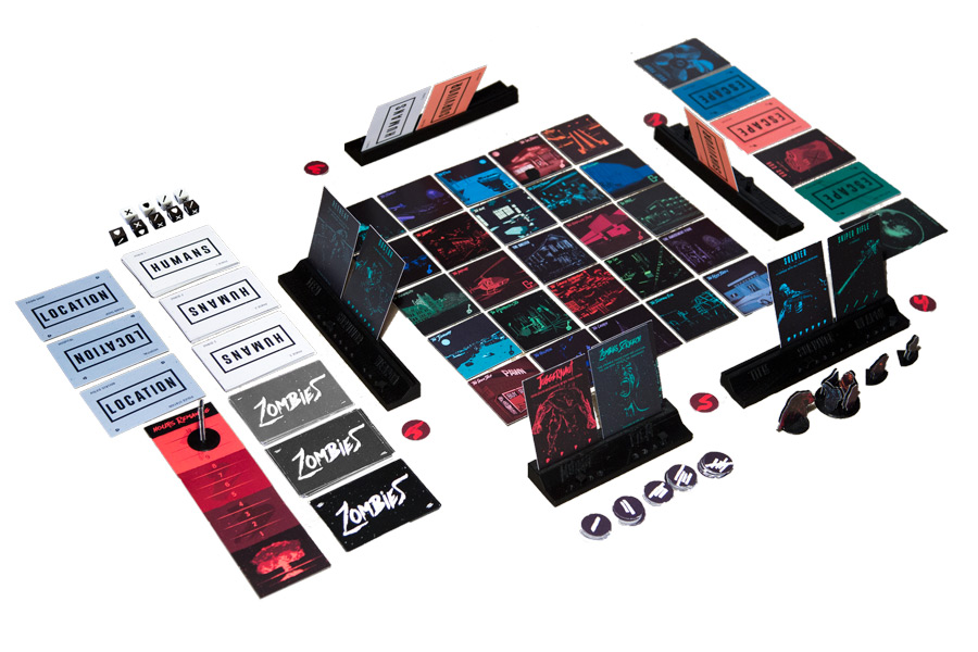
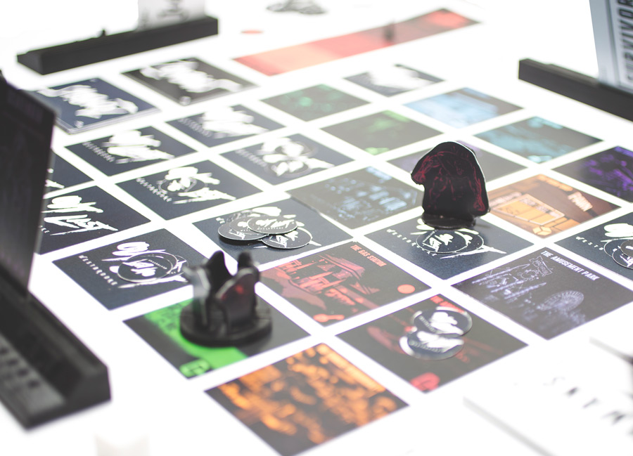
And lastly the game to needed to be simple and easy to learn but still offer enough complexity to keep you entertained. The game board is composed of 25 tiles that are laid out differently each game. This allows for loads of different outcomes and makes the game different each time. Kevin and Nathan worked for over a year and a half to whittle down the rules and components to what they thought was necessary for an easy to learn and competitive game with outstanding artwork.
You can visit the Kickstarter page, or you can visit the PsychoCat site for more information.
Did you like this story? Please share or comment. Go to this page to submit a story yourself. Subscribe to our online magazine here!
For my thesis, I consulted a lot of information, read your article made me feel a lot, benefited me a lot from it, thank you for your help. Thanks!
The point of view of your article has taught me a lot, and I already know how to improve the paper on gate.oi, thank you. https://www.gate.io/th/signup/XwNAU
I don’t think the title of your enticle matches the content lol. Just kidding, mainly because I had some doubts after reading the enticle. https://accounts.binance.com/en/register-person?ref=P9L9FQKY
Thanks for sharing. I read many of your blog posts, cool, your blog is very good. https://accounts.binance.com/sv/register?ref=FIHEGIZ8
I’ve been absent for a while, and now I remember why I liked this website. Thank you, I’ll check it out often. How often do you update your website? 먹튀검증
Your point of view caught my eye and was very interesting. Thanks. I have a question for you.
It’s a game. Five dollars is free. Try it It’s not an easy game
->-> 토토사이트
This human vs. zombie board game sounds like an exciting concept—such a fun way to spark creativity and strategy! It reminds me of how small changes in design can make a big difference. Similarly, in aesthetics, ensuring balance is key—avoiding overdone cheek filler can help maintain a natural and youthful appearance. Thanks for sharing this intriguing idea—it’s definitely sparked some interest!
Human vs. zombie board games are always a fun and intense way to challenge your strategy skills! While you’re battling zombies in the game, it’s also important to take care of yourself in real life. For example, dermal filler Montebello CA can help you maintain a youthful appearance by reducing wrinkles and restoring volume, so you can look and feel your best while taking on any challenge—zombie or otherwise!